4 Introducing traditional R graphics
A basic knowledge of R graphics is needed before directing attention to the art of writing programs (functions) in R. Therefore, in this chapter a brief overview is given of the basics of traditional R graphics. In a later chapter, after studying the principles of R programming, a second round of R graphics will follow.
4.1 General
Study the graphical parameters by requesting
?parIn Figure 4.1 the main components of a graph window are illustrated. Study this figure in detail. The Plot Region together with the Margins is called the Figure Region.
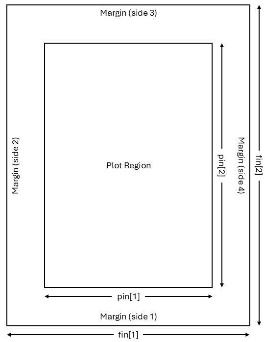
Figure 4.1: The main components of a graph window and the parameters for controlling their sizes. The parameter mai is a numerical vector of the form c(bottom, left, top, right) specifying the margins in inches while the parameter mar has a similar form specifying the respective margins as the number of lines. The default of mar is c(5, 4, 4, 2) + 0.1.
What is the difference between high-level and low-level plotting instructions?
Take note especially how the functions
windows(),win.graph()orx11()are used as well as the different options available for these functions.The instruction
dev.new()allows opening a new graph window in a platform-independent way.In this chapter some high-level plotting instructions are studied. Each of these instructions results in a (new) graph window with a complete graph drawn. The command
graphics.off()deletes all open graphic devices.Study the use of
par(),par(mfrow =)andpar(mfcol =). Study the use ofpar(new = TRUE)to plot more than one figure on the same set of axes.Study how the functions
graphics.off()anddev.off()work.
4.2 High-level plotting instructions
- Construct a barplot of the illiteracy of the states according to the
areagrp(as defined in section 3.5.10) in thestate.x77dataframe. Hint: The functiontapply()operates on a vector given as its first argument. Its second argument groups the first argument into groups so that the function given in its third argument can be applied to each of these groups. Study the following command:
barplot (tapply (state.x77[, "Illiteracy"], areagrp, mean),
         names=levels(areagrp), ylab = "Illiteracy", xlab = "Area of State",
main = "Barplot of Mean Illiteracy")- Construct, for the
state.x77data set, box plots of illiteracy broken down by the income of the states. First usecut()to form three categories of state income:
state.income <- cut (state.x77[ , "Income"], c(0, 4000, 5000, Inf),
labels=c("$4000 or less", "$4001-$5000", "more than $5001"))Add labels for the axes as well as a title for the figure.
Repeat the previous example but use argument
notch = TRUE.Attach the package
akima. What is the usage of the functioninterp()? Discuss by constructing the following contour plot:
contour (interp (state.center$x, state.center$y, state.x77[,"Frost"])) - What is a coplot? Discuss after giving the following instruction and referring to the role of the tilde (~) operator.
coplot (state.x77[,"Illiteracy"] ~ state.x77[,"Area"] | state.x77[,"Income"])- A dotchart is constructed with function
dotchart(). First some preparations are necessary:
incgroup <- cut(state.x77[,"Income"],  3,
                labels = c("LowInc", "MediumInc", "HighInc"))
lifgroup <- cut(state.x77[,"Life Exp"], 2,
                labels = c("LowExp", "HighExp"))
table.out <- tapply(state.x77 [,"Income"], list(lifgroup,incgroup), mean)
table.out
#>           LowInc MediumInc HighInc
#> LowExp  3640.917  4698.417    5807
#> HighExp 4039.600  4697.667    5348
dotchart (table.out,
          levels (factor (col (table.out),
                          labels = levels (incgroup)))[col(table.out)],
          factor(row(table.out), labels = levels(lifgroup)))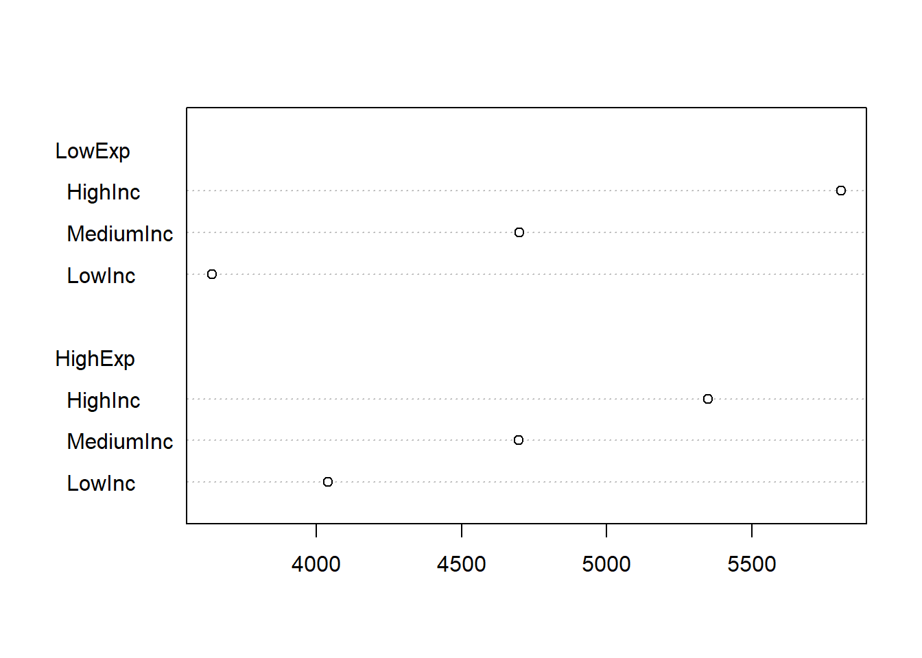
Complete the graph by adding a label to the x-axis and a heading for the graph.
Use function
faces()available in packageaplpackto construct Chernoff faces for the Western states in the data setstate.x77. Hint: The Western states appear in rows 3, 5, 12, 26, 28, 37, 44, 47 and 50. Explain what is represented by each of the facial features. First set argumentface.type = 0and thenface.type = 1.Obtain a histogram of the life expectancy in the states of
state.x77.Execute the command
pairs (state.x77)Interpret the graph.
- Three-dimensional graphs are constructed with function
persp().
pts <- seq(from = -pi, to = pi, len = 20)
z <- outer(X = pts, Y = pts, function(x,y) sin(x)*cos(y))
persp(x = pts, y = pts, z, theta = 10, phi = 60, ticktype = 'detailed')
Discuss the meaning of each of the above instructions. Experiment with different values for arguments theta and phi.
Obtain a pie chart of the object
areagrpdefined in section 3.5.10. Hint: functiontable()may be useful here.A cluster plot (dendrogram) can be constructed with function
plclust()as follows:
west.rows <- c(3, 5, 12, 26, 28, 37, 44, 47, 50)
distmat.west <- dist (scale (state.x77[west.rows,]))
plot(hclust(distmat.west), labels = rownames(state.x77)[west.rows])
Interpret the above instructions and the resulting plot.
Use the function
plot()to plot \(sin (\theta)\) as \(\theta\) varies from \(–\pi\) to \(\pi\).Could you explain the different graphs resulting from the two calls in (l) and (m) to the
plot()function above?Obtain the empirical distribution function of variable
Life Expin thestate.x77data set by using the functionscut(),ecdf()andplot().Check the normality of variable
Incomein thestate.x77 data set by using functionqqnorm().Obtain a
qqplotof the income of small states versus the income of large states in the data setstate.x77where small and large are defined as below or above the median income, respectively.
state.size <- cut (state.x77[,"Area"],
                   c(0, median (state.x77[,"Area"]), max (state.x77[,"Area"])))
state.income <- split (state.x77[,"Income"], state.size)
qqplot(state.income[[1]], state.income[[2]], xlab="Income for small states",
ylab="income for large states")- Use function
ts.plot()to construct a time series plot of the sunspots data set.
4.3 Interactive communication with graphs
Study the help files of the functions
text(),identify()andlocator().Illustrate the usage of
identify()on a scatterplot of variablesIlliteracyandLife Expin thestate.x77data set:
plot (x = state.x77[,'Life Exp'], y = state.x77[,'Income'])To create the scatterplot, then call
identify (x = state.x77[,'Life Exp'], y = state.x77[,'Income'],
          seq (along = rownames(state.x77)), n = 5)
Notice the change in the cursor; the cursor changes to a cross when moved over the graph. Hover the cursor over a point to identify and click left mouse button. Repeat \(n = 5\) times. Explain the result. Next, create the scatterplot once more and then call
identify (x = state.x77[,'Life Exp'],  y = state.x77[,'Income'],
          labels = rownames(state.x77)[seq (along =
                                              rownames(state.x77))] , n = 5)
Explain what has happened.
- Illustrate the usage of
locator()by:
- Joining \(5\) user defined points on a graph interactively with straight lines.
Use mouse and select the five points on the graph. What happened on the graph? What happened in the commands window?
- Writing text interactively at a specified position on an existing graph.
4.4 3D graphics: package rgl
Write and execute the following function.
rgl.example <- function (size = 0.1, col = "green", alpha.3d = 0.6)
{ require(rgl)
  datmat <- matrix (rnorm (30), ncol = 3)
  open3d()
  spheres3d (datmat,radius = size, color = col, alpha = alpha.3d)
  axes3d(col = "black")
  device.ID <- rgl.cur()
  answer <- readline ("Save 3D graph as a .png file? Y/N\n")
  while (!(answer == "Y" | answer == "y" | answer == "N" | answer == "n"))
    answer <- readline("Save 3D graph as a .png file? Y/N\n")
  if (answer == "Y" | answer == "y")
    repeat
    { file.name <- readline ("Provide file name including full
                              path NOT in quotes and SINGLE
                              back slashes!\n")
      file.name <- paste (file.name, ".png", sep = "")
      snapshot3d (file = file.name)
      rgl.set (device.ID)
      answer2 <- readline("Save another 3D graph as a .png file? Y/N \n")
      if (answer2 == "Y" | answer2 == "y") next else break
    }
  else set3d (device.ID)
}
Study the above code and constructions in detail.
4.5 Exercise
Obtain a graph of a \(normal(100, 25)\) probability density function (p.d.f.).
-
Plot on the same set of axes
- a central \(beta(9, 5)\) p.d.f.;
- a non-central \(beta(9 5)\) p.d.f. with non-centrality parameter = \(15\) and
- a non-central \(beta(9, 5)\) p.d.f. with non-centrality parameter = \(40\).
Add a suitable legend to the plot.
- Use
persp()to obtain a graph of any user specified bivariate function. The challenge is that the function specification must appear as the main title of the graph. In order to address this problem we need information about the arguments ofpersp():
args (persp)
#> function (x, ...)
#> NULL
This is not very helpful so we try
methods (persp)
#> [1] persp.default*
#> see '?methods' for accessing help and source code
args (persp.default)
#> Error: object 'persp.default' not found
The reason for this error message follows from the above as that persp.default is not visible. The immediate visibility of a function is regulated by a package builder through the package’s namespace mechanism. Only object names that are exported are immediately visible; object names that are not exported are marked with an asterisk and are not visible. The functions
argsAnywhere() and getAnywhere() are available to get information on asterisked object names:
argsAnywhere (persp.default)
#> function (x = seq(0, 1, length.out = nrow(z)), y = seq(0, 1,
#>     length.out = ncol(z)), z, xlim = range(x), ylim = range(y),
#>     zlim = range(z, na.rm = TRUE), xlab = NULL, ylab = NULL,
#>     zlab = NULL, main = NULL, sub = NULL, theta = 0, phi = 15,
#>     r = sqrt(3), d = 1, scale = TRUE, expand = 1, col = "white",
#>     border = NULL, ltheta = -135, lphi = 0, shade = NA, box = TRUE,
#>     axes = TRUE, nticks = 5, ticktype = "simple", ...)
#> NULL
We notice that we can make use of the argument main in a call to persp() to provide our perspective plot with a title. However, main accepts only character strings and not mathematical expressions. Furthermore, we have seen in the persp() example in section 4.2 that the values for the argument z are conveniently found by a call to outer() using its argument FUN. However FUN requires a function. So we need the means to convert expressions into character strings and vice versa to convert character strings into expressions.
The following pairs of functions allow these conversions to be made:
Character strings (” “) → expressions: parse() and eval()
Expressions (unquoted) → character strings (” “): deparse() and substitute()
pts <- seq (from = -3, to = 3, len = 50)
fun1 <- "2 * pi * exp(-(x^2 + y^2)/2)"
fun2 <- parse (text = paste ("function(x,y)", fun1))
Explain carefully what parse() is doing.
Explain carefully what eval() is doing.
persp (x = pts, y = pts, z = zz, theta = 0, phi = 15, ticktype = "detailed",
       main = paste("Persp plot of `fun2,`",sep=""))
Explain carefully the role of paste().
-
Use the
volcanodata to:Obtain a perspective plot using
persp().Obtain an RGL plot of the
volcanodata.